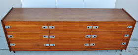
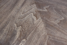
Although this dresser was made in Canada by ICD Ltd (Inter-Continental Designs Ltd), it looks and is built very much like a Danish piece. The drawers glide on side mounted glides. Solid teak was used for the case edge banding (not a thin veneer). The raised portion on the side panels are solid and nicely shaped teak. The case uses good mitered joinery and the back is real plywood, not pressed board. The chrome pulls are a unique feature and are heavily chromed steel plates that give a good substantial feel and are durable as well. At 25" high, this piece is about 6" lower than most dressers, adding to the sleek modern aesthetic. This also makes it particularly good to use as a perch for a flat screen TV. Even though it is low, it is nearly 6 1/2 feet long so there is plenty of storage space in the 9 equally sized drawers.
Dimensions: 77"W x 25"H x 18 1/2"D
Sold
Wednesday, March 30, 2016
Saturday, March 26, 2016
Oak and Chrome Credenza by Davis Allen
When I find exceptional pieces I often go on about the quality of the joinery, use of solid wood, graceful curves, handworked details, etc. This isn't one of those pieces. As a piece of business furniture, this was designed for the rigors of the corporate environment where furniture is in continuous use for 8-12 hours a day, often being moved around from floor to floor and office to office. This credenza was very well designed for this purpose and is more a marvel of engineering than it is a crafted piece of fine furniture. However, there are a few things that attracted me to this piece. The fine chrome drawer pulls, chrome blade steel legs and chrome trim are reminiscent of designs by George Nelson or Florence Knoll. The oak used in this piece exhibited beautiful cathedraling and it is finished on all 4 sides. It is also lower than most credenzas which makes it very useful as a TV or media stand. The lower profile ads to its modernist stature.
Allen Davis is not a designer most people are familiar with. He is recognized as one of the pioneers in post WWII business environment design. His prolific 50 year career included designing for Knoll, Stendig, Stow Davis and Steelcase. In 1985 he was one of the first 15 inductees into the Interior Design Hall of Fame.
This piece was built in 1972. It is constructed on a heavy steel chassis with drawers using steel boxes and heavy duty steel glides. The manufacturer, GF Furniture, specialized in constructing fireproof business furnishings and although this piece is not fireproof, their expertise is evident in its construction. Because of the construction technique this piece is very heavy, I'm guessing 350 lbs. The center "open storage" area features one adjustable steel shelf.
As I have with other oak pieces recently I opted to finish this with a cerused technique. The "background" color is a dark brown and black with the grain filled with a contrasting white. I love the look this gives oak pieces and it fits in well with today's modern industrial aesthetic.
Dimensions: 65"W x 25"H x 21"H
Sold
Tuesday, March 15, 2016
Restyled Stanley Mid Century Dining Table
I've been on the hunt for other dining tables that I could refinish with a cerused finish. The oak one I did last year turned out beautifully. When this table popped up and I saw the interesting grain patterns and veneer layups I knew it had potential. As I began work, I realized the solid edges were oak and the veneers were pecan. Pecan has a similar natural color to oak, but a different grain structure. It also takes stain differently. This results in a different effect than the ceruse finish on oak. I wouldn't say this has a traditional modernist aesthetic but would work will with industrial modern or modern farmhouse styles.
The table is a large, nicely constructed piece by Stanley (manufactured in 1975). With no leaves there is ample seating for 6. With the use of the 2 leaves this table can seat 10. With the finish process I used the overall color is similar to a slate gray. The finish shows undertones of dark brown and black and the grain fill is a light gray.
Logistics often dictate my photography quality. I don't have a properly lit studio and had no help to move the piece to a better location. It isn't my best photography effort but the pics convey the end result well enough.
Dimensions: 68"L x 42"W x 29.5"H (no leaves)
104"L with 2 leaves
Sold
Saturday, March 12, 2016
Dillingham Walnut Credenza Attributed to Milo Baughman
This beautiful credenza by Dillingham is a classic example of good modernist design. Clean straight lines are uninterrupted by hardware or other visual distractions. This allows the beautiful materials to be the main attraction. The veneers used on the doors are bookmatched across the front, enhancing the symmetry of the piece. Inside there is ample storage for china or electronics or whatever needs to be stored. There are two small drawers on the left side with a fixed shelf and one adjustable shelf on the right.
No piece is ever perfect but I try to erase as many of the imperfections as possible as I go through the refinishing process. If you've ever tried refinishing furniture there is a good chance you've taken the "erasing" process too far and sanded through veneer. It's a sickening feeling to realize what you've done and the result is pretty unsightly. With as many pieces as I've refinished now I have a pretty good idea how much sanding is too much. This piece has a few scratches that were obviously pretty deep when I started. I was able to make many disappear but had to stop on some of them so that I didn't do further damage. I don't think they detract much from the overall appearance but they are there and are captured in some of the pics. I have adjusted the price accordingly.
Dimensions: 74"W x 19"D x 29.5"H
sold


