Monday, November 24, 2014

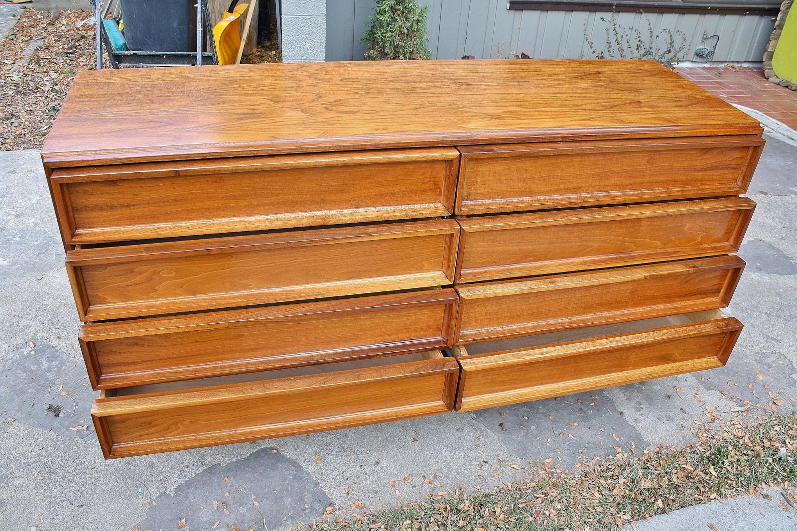
Walnut Brown Saltman 8 Drawer Dresser by John Keal


Many mid-century enthusiasts may not be familiar with Brown-Saltman.  They have produced pieces designed by some of the pillars of modern design such as Gilbert Rohde, Paul Frankl, Paul Laszlo and John Keal.  Keal did much of his design work for Brown-Saltman and was known for his clean lined designs, great focus on details and adding in features such as sliding tambour tops or coffee warmers in side tables.

This piece is a fine example of Keal's work.  The design reminds me a bit of an Aston Martin sports car.  It is subtle enough that many might pass it by not realizing its beauty.  It may gain notice because of its lower than normal stature but its excellence isn't revealed until you look more closely.  Prodigious amounts of solid walnut were used in its construction, from the elegantly profiled "picture frame" profile of each drawer and perimeter of the case, to the solid walnut pedestal base.  Also of note on the base, this particular piece uses some of the darkest walnut I've seen.  I thought it may be ebony wood at first but closer inspection of grain structure and walnut's characteristic odor as I sanded it confirmed the species.  Beautiful casework and joinery ensure this piece is ready to serve duty another 50 years.  Brown Saltman also used very high quality side mount roller drawer glides for strength and durability and the drawers glide open and closed with ease.
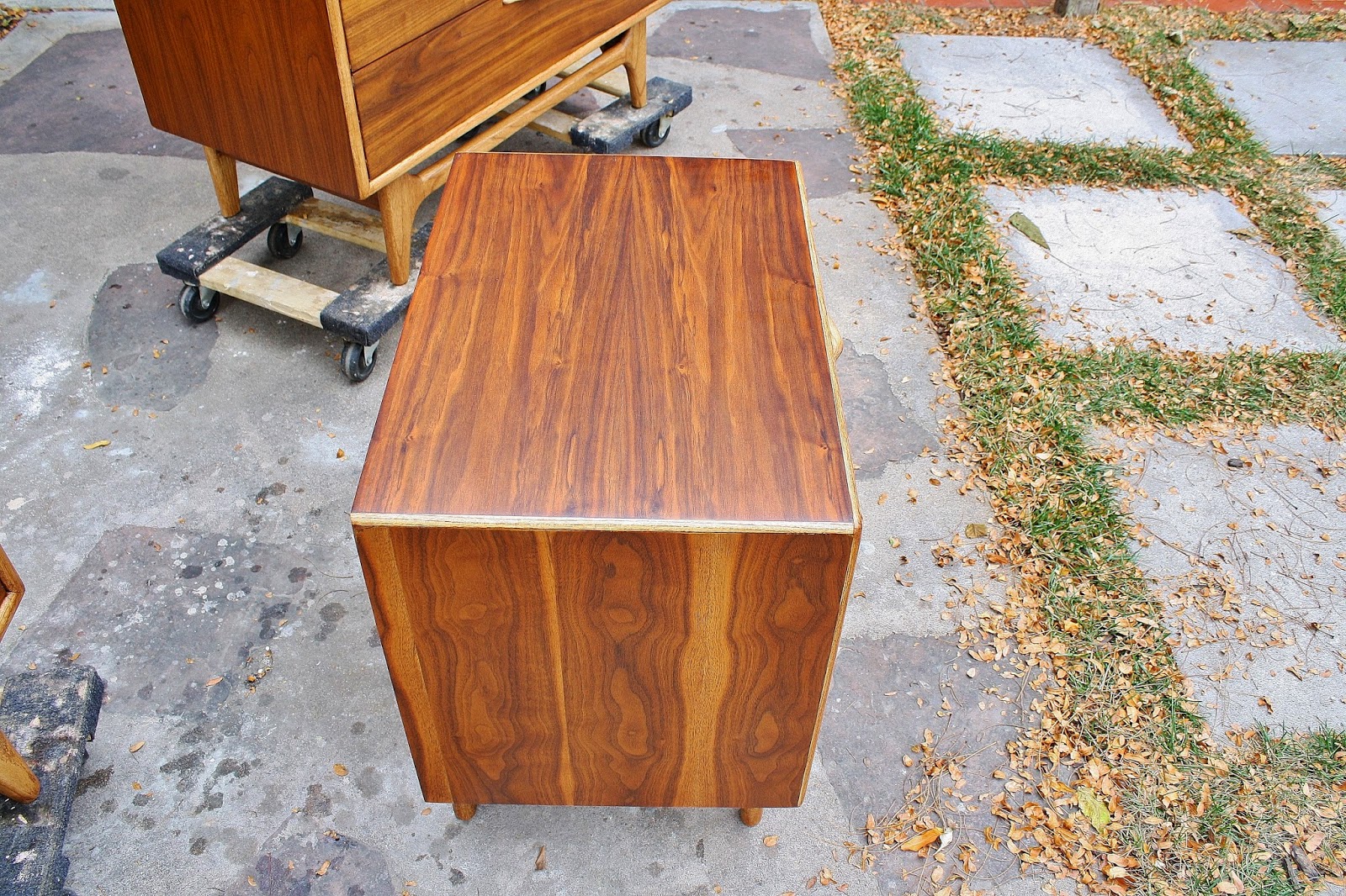
Beautifully figured walnut veneers wrap the case and the drawers are all bookmatched.

On most pieces I don't mention much on the mirror but this one is very high quality with a solid walnut frame that has a matching profile to the drawers and heavy high quality glass.  It can be mounted to the dresser or hung separately. (pics added at bottom)

It is a rare opportunity to own such a high quality piece of mid century furniture and this one now looks nearly new.

Here is a place in L.A. selling the same dresser, also restored without the mirror for nearly double.
http://instagram.com/p/v9f5a_KgJ9/?modal=true


Dimensions:  60"W x 28"H x 20"D
        mirror:   34" x 44"

sold


Friday, November 21, 2014

Stunning Restored Modernist Dressers by United Furniture

As I began writing the blog post describing these pieces I found myself researching the definition of art.  It seems there are as many opinions on the definition of art as there are opinions on art itself.  I came across a description in the Stanford Encyclopedia of Philosophy that is used as one of the constraints on defining art.

"traditionally, artworks are intentionally endowed by their makers with properties, usually perceptual, having a significant degree of aesthetic interest, often surpassing that of most everyday objects"

While one could argue that most designed objects have a degree of aesthetic interest designed into them, it is the "often surpassing that of most everyday objects" that elevates an object to the status of a work of art.

The visual impact of these pieces will be decor defining.  With their scale and geometry, the meticulously detailed lay-up of the veneers and the organic feel of the sculpted figures they will be the focal point of a room.  They are not pieces for one looking for furniture to blend into its surroundings.

The low dresser has 3 large center drawers with another 3 drawers behind each of the figured doors.  The chest has 3 large drawers at the bottom with 2 smaller drawers above and open storage with a single adjustable shelf behind its figured door.  The large capacity of both pieces make them as functional as they are beautiful.

As I do with all my restorations I try to enhance the natural beauty of the materials as much as possible.  The original finish hid all the beautiful figuring and color variation of the walnut veneers.  The oak used in the figures and some of the trim has been dyed so that it works in harmony with the walnut.

These beautiful statement pieces are ready to become functional new additions to your art collection.

Dimensions:

9-drawer dresser: 74"W x 32"H x 20"D
5-drawer chest:    41"W x 48"H x 20"D

sold


Sunday, November 9, 2014

On the horizon.....

Since I spent some time working on the pre-sold Perception set it doesn't seem like I've had much to post in the past couple of weeks.  I'm working on a very cool set of sculptural United Furniture dressers, one long, low dresser the other an upright chest.  They are pretty much ready to start finishing.  However, also on the horizon is a polar vortex.  With the temps dipping pretty low this coming week I'm not sure how well I will be able to progress with application of finish.  Cold is not very conducive to finish curing and it isn't worth having a sticky finish on a piece for days.  We also have holidays on the horizon as well as shorter days.  I've also lost my babysitter that helped out a few hours a week and gave me a chance to work on furniture (for those who don't know, stay-at-home dad is my full time job).  I'm anticipating my output is going to drop a bit the next few weeks.  Its frustrating because I have some really cool pieces I'm looking forward to working on.  I'll try to fill in the gaps with some other posts.  Please stay tuned.

Update 

I managed to get the first coat of finish on the United pieces before the storm started moving in.  Not sure when I'll get the the second coat.  Here are some quick pics.  These are special!


Saturday, November 8, 2014

Cavalier Furnture Walnut 4-Drawer Chest

Cavalier Furniture is not a name you come across everyday when looking for mid mod furniture.  It is most notable, at least for modernists, that Gilbert Rohde did some design work for Cavalier.  Why is this important?  In 1930 Rohde approached D.J. DePree, founder of Herman Miller to try to convince him to make some of his furniture designs.  Herman Miller was in trouble and Rohde argued with DePree that his modern designs were not only more readily manufactured but more suited to modern lifestyles with their more simple designs and smaller scale.  Rohde convinced DePree and he was given a design contract, a move that is credited for saving Herman Miller.  Of course Herman Miller went on to become the most widely recognized name in modern furniture with names like George Nelson, George Nakashima and Charles Eames having designs made by Herman Miller.  Rohde passed away at a fairly young age so wasn't as prolific as many of the other well known designers but was a strong proponent of modern design philosophy.  For more of the Rohde/Herman Miller story take a look at this article.
http://www.themagazineantiques.com/articles/gilbert-rohde-the-man-who-saved-herman-miller/


This 4-drawer chest was thoughtfully designed using many of the modern philosophies that Rohde championed.  Its clean, simple design withstands the test of time.  The inset pulls are subtly highlighted  with a slim bright brass trim.  The sturdy square legs and stretcher are reminiscent of Danish design.  These and the front edge of the case as well as the top and bottom face trim are all made of solid walnut, not something you see on pieces from more well known makers like Lane, Broyhill or American of Martinsville.  It was built to last with good joinery and hardwood case materials, something else Rohde was a proponent of.

This particular piece was very well "traveled" when I acquired it.  The finish was gone from parts of the top, there were missing chunks of veneer and a number of pretty deep scrapes.  Upon close inspection there is still some evidence of these scars but none that take away from the nice design and materials used in the piece.  Although I would not attribute this design directly to Gilbert Rohde, his legacy is clearly evident in it.

Dimensions: 42"W x 34"H x 21 1/2"D

Sold


Friday, November 7, 2014

Lane Perception Bedroom Set

Warren Church's design of Lane's Perception line was so well executed it could be dropped into a West Elm or Crate and Barrel catalog today and still be very successful.  Although many of the pieces from this line incorporated wooden basketweave elements, the pieces in this set did not and they are my favorites of the line.  These have a distinctly Danish feel with their organically shaped wood pulls and legs and rounded, solid case corners and front edge detail.  Like some of Church's other designs walnut was the primary case material with legs, edges and pulls of oak.  As was typical of most furniture made in those days, these were finished with a tinted lacquer that blurred the distinction of the two materials as well as the grain in the nice walnut veneers.

On this set I opted to go in a different design direction from the manufacturer and showcased the contrast in materials.  I lightly dyed the oak pieces, enough to tone them down from the nearly bone white color they would have been but still enough to contrast with the walnut.  Not only does this bring attention to the graceful pulls and legs but it also brings out some of the lighter sapwood coloring in the walnut and exaggerates the grain variation.  The result is a more modern expression of classic mid-century design.

This set was sold before completed.  My photographer friend Michael Nelson of Adoration Pro Photo, recently moved into a new house and they needed to some new pieces to go along with it.  He has been great in helping me elevate my photos from crappy to passable, so I was happy I could return the favor.